Angular Tutorial - Tour of Heroes - Part 3 (Display a selection list)
Introduction
This tutorial recaps the official documentation at https://angular.io/tutorial/tour-of-heroes/toh-pt2.
This tutorial shows you how to:
Expand the Tour of Heroes application to display a list of heroes. Allow users to select a hero and display the hero’s details.
Create mock heroes
The first step is to create some heroes to display.
Create a file called mock-heroes.ts in the src/app/ directory. Define a HEROES constant as an array of ten heroes and export it. The file src/app/mock-heroes.ts should look like this.
import { Hero } from './hero';

export const HEROES: Hero[] = [
  { id: 12, name: 'Dr. Nice' },
  { id: 13, name: 'Bombasto' },
  { id: 14, name: 'Celeritas' },
  { id: 15, name: 'Magneta' },
  { id: 16, name: 'RubberMan' },
  { id: 17, name: 'Dynama' },
  { id: 18, name: 'Dr. IQ' },
  { id: 19, name: 'Magma' },
  { id: 20, name: 'Tornado' }
];
Displaying heroes
Open the HeroesComponent class file src/app/heroes/heroes.component.ts and import the mock HEROES.
import { HEROES } from '../mock-heroes';
In HeroesComponent class, define a component property called heroes to expose the HEROES array for binding:
export class HeroesComponent {
  heroes = HEROES;
}
List heroes with *ngFor
Open the HeroesComponent template file and make the following changes:
- Add an
<h2>at the top. - Below the
<h2>, add a<ul>element. - In the
<ul>element, insert an<li>. - Place a
<button>inside the<li>that displays properties of a hero inside<span>elements. - Add CSS classes to style the component.
to look src/app/heroes/heroes.component.html like this (delete old content):
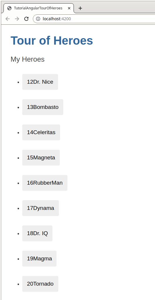
<h2>My Heroes</h2>
<ul class="heroes">
  <li>
    <button type="button">
      <span class="badge">{{hero.id}}</span>
      <span class="name">{{hero.name}}</span>
    </button>
  </li>
</ul>
That displays an error since the hero property doesn’t exist. To have access to each individual hero and list them all, add an *ngFor to the <li> to iterate through the list of heroes:
<li *ngFor="let hero of heroes">
The *ngFor is Angular’s repeater directive. It repeats the host element for each element in a list.
The syntax in this example is as follows:
<li>- The host element.heroes- Holds the mock heroes list from theHeroesComponentclass, the mock heroes list.hero- Holds the current hero object for each iteration through the list.
Note: Don’t forget to put the asterisk * in front of ngFor. It’s a critical part of the syntax.
After the browser refreshes, the list of heroes appears.
Interactive elements
Inside the <li> element, we added a <button> element to wrap the hero’s details, and then make the hero clickable. To improve accessibility, use HTML elements that are inherently interactive instead of adding an event listener to a non-interactive element. In this case, the interactive <button> element is used instead of adding an event to the <li> element.
For more details on accessibility, see Accessibility in Angular.
Style the heroes
The heroes list should be attractive and should respond visually when users hover over and select a hero from the list.
In the first part of this tutorial, you set the basic styles for the entire application in styles.css. That style sheet didn’t include styles for this list of heroes.
You could add more styles to styles.css and keep growing that style sheet as you add components.
You may prefer instead to define private styles for a specific component. This keeps everything a component needs, such as the code, the HTML, and the CSS, together in one place.
This approach makes it easier to re-use the component somewhere else and deliver the component’s intended appearance even if the global styles are different.
You define private styles either inline in the @Component.styles array (see https://angular.io/api/core/Component#styles) or as style sheet file identified in the @Component.styleUrls array (see https://angular.io/api/core/Component#styleUrls).
When the ng generate created the HeroesComponent, it created an empty heroes.component.css style sheet for the HeroesComponent and pointed to it in @Component.styleUrls like this.
File src/app/heroes/heroes.component.ts:
@Component({
  selector: 'app-heroes',
  templateUrl: './heroes.component.html',
  styleUrls: ['./heroes.component.css']
})
Open the src/app/heroes/heroes.component.css file and paste in the private CSS styles for the HeroesComponent:
/* HeroesComponent's private CSS styles */
.heroes {
  margin: 0 0 2em 0;
  list-style-type: none;
  padding: 0;
  width: 15em;
}

.heroes li {
  display: flex;
}

.heroes button {
  flex: 1;
  cursor: pointer;
  position: relative;
  left: 0;
  background-color: #EEE;
  margin: .5em;
  padding: 0;
  border-radius: 4px;
  display: flex;
  align-items: stretch;
  height: 1.8em;
}

.heroes button:hover {
  color: #2c3a41;
  background-color: #e6e6e6;
  left: .1em;
}

.heroes button:active {
  background-color: #525252;
  color: #fafafa;
}

.heroes button.selected {
  background-color: black;
  color: white;
}

.heroes button.selected:hover {
  background-color: #505050;
  color: white;
}

.heroes button.selected:active {
  background-color: black;
  color: white;
}

.heroes .badge {
  display: inline-block;
  font-size: small;
  color: white;
  padding: 0.8em 0.7em 0 0.7em;
  background-color: #405061;
  line-height: 1em;
  margin-right: .8em;
  border-radius: 4px 0 0 4px;
}

.heroes .name {
  align-self: center;
}
Note: Styles and style sheets identified in @Component metadata are scoped to that specific component. The heroes.component.css styles apply only to the HeroesComponent and don’t affect the outer HTML or the HTML in any other component.
Styled list:
Viewing details
When the user clicks a hero in the list, the component should display the selected hero’s details at the bottom of the page.
The code in this section listens for the hero item click event and displays/updates the hero details.
Add a click event binding
Add a click event binding to the <button> in the <li> like this.
File src/app/heroes/heroes.component.html:
<li *ngFor="let hero of heroes">
  <button type="button" (click)="onSelect(hero)">
This is an example of Angular’s event binding (see https://angular.io/guide/event-binding) syntax.
The parentheses around click tell Angular to listen for the <button> element’s click event. When the user clicks the <button>, Angular executes the onSelect(hero) expression.
In the next section, define an onSelect() method in HeroesComponent to display the hero that was defined in the *ngFor expression.
Add the click event handler
Add a selectedHero property but don’t assign any value to it since there is no selected hero when the application starts.
Add the following onSelect() method, which assigns the clicked hero from the template to the component’s selectedHero.
File src/app/heroes/heroes.component.ts:
export class HeroesComponent {
  heroes = HEROES;
  selectedHero?: Hero;

  onSelect(hero: Hero): void {
    this.selectedHero = hero;
  }
}
Add a details section
Currently, you have a list in the component template. To show details about a hero when you click their name in the list, add a section in the template that displays their details. Add the following to src/app/heroes/heroes.component.html beneath the list section:
<div *ngIf="selectedHero">
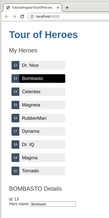
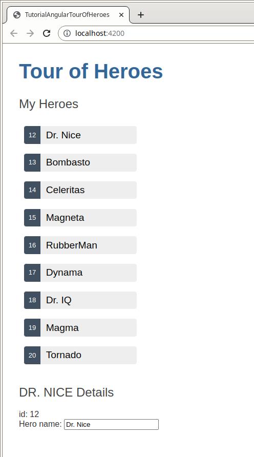
<h2>{{selectedHero.name | uppercase}} Details</h2>
<div>id: {{selectedHero.id}}</div>
<div>
<label for="hero-name">Hero name: </label>
<input id="hero-name" [(ngModel)]="selectedHero.name" placeholder="name">
</div>
</div>
The hero details should only be displayed when a hero is selected. When a component is created initially, there is no selected hero. Add the *ngIf directive to the <div> that wraps the hero details. This directive tells Angular to render the section only when the selectedHero is defined after it has been selected by clicking on a hero.
Note: Don’t forget the asterisk * character in front of ngIf. It’s a critical part of the syntax.
Style the selected hero
To help identify the selected hero, you can use the .selected CSS class in the styles you added earlier. To apply the .selected class to the <li> when the user clicks it, use class binding.
Angular’s class binding (see https://angular.io/guide/class-binding) can add and remove a CSS class conditionally. Add [class.some-css-class]="some-condition" to the element you want to style.
Add the following [class.selected] binding to the <button> in the HeroesComponent template src/app/heroes/heroes.component.html:
<li *ngFor="let hero of heroes">
  <button [class.selected]="hero === selectedHero" type="button" (click)="onSelect(hero)">
    <span class="badge"></span>
    <span class="name"></span>
  </button>
</li>
When the current row hero is the same as the selectedHero, Angular adds the selected CSS class. When the two heroes are different, Angular removes the class.
Final result: