Dashboard Layout (sticky top nav and sidebar) with Boostrap 5 and Angular
- Add Bootstrap 5 to project
- Add Bootstrap 5 icons
- Angular directory structure
- Bootstrap 5 dashboard layout
- Create and integrate basic
LayoutComponent - Create feature component / page
- Add feature components as child routes
- Dynamic Breadcrumb navigation
- Sidebar navigation items
- Final result
When it comes to implement a webapp with many structured functionality a dashboard layout is often a good choice. With a sticky top navigation bar and a sticky navigation sidebar you provide a well known usability experience to the users.
Bootstrap 5 provides the needed CSS framework for the layout. We will build a dynamic SPA (Single Page Application) dashboard in combination with Angular step by step.
Add Bootstrap 5 to project
To add Bootstrap 5 to your Angular project, you can follow these steps:
- Change to project’s directory and run
npm install bootstrap - Add Bootstrap CSS and JS to your project: Open
angular.jsonand add the path to Bootstrap CSS in thestylesarray and the path to Bootstrap JS in thescriptsarray:"architect": { "build": { "options": { "styles": [ "src/styles.scss", "node_modules/bootstrap/dist/css/bootstrap.min.css" ], "scripts": [ "node_modules/bootstrap/dist/js/bootstrap.bundle.min.js" ]
Bootstrap CSS will be included into the generated styles-....css file, and the JS will be included into the generated scripts-...js file during build, and both will be integrated into the index.html file.
Now we can use Bootstrap in our project, it will be available in all components.
Add Bootstrap 5 icons
For the icons we will use the Bootstrap 5 icon library. To add it to your project, you can follow these steps:
- Change to project’s directory and run
npm install bootstrap-icons - Add Bootstrap Icons CSS to your project: Open
angular.jsonand add the path to Bootstrap Icons CSS in thestylesarray:"architect": { "build": { "options": { "styles": [ "src/styles.scss", "node_modules/bootstrap/dist/css/bootstrap.min.css" "node_modules/bootstrap-icons/font/bootstrap-icons.css" ],
Angular directory structure
To structure your Angular project so that the layout is separate from inner components, a clean directory organization will help maintain clarity and scalability. Here’s a suggested structure:
/public
  /assets                  # Static assets (images, fonts, etc.)
    /css
    /fonts
    /img
  favicon.ico              # Favicon
  index.html               # Main HTML file
  robots.txt               # Robots.txt file
/src
  /app
    /core                  # Global services, guards, interceptors
    /features              # Contains individual feature modules
      /dashboard           # Dashboard feature module
      /settings            # Settings feature module
    /layout                # Contains layout-related components
      /navbar              # Top navbar component
      /sidebar             # Sidebar component
      /footer              # Footer component
      layout.component.ts  # Wrapper component holding layout structure
    /pages                 # Standalone pages (e.g., login, error pages)
    /shared                # Reusable components, pipes, directives
    app.component.ts       # Root component
    app.config.ts          # application configuration that tells Angular how to assemble the application
    app.routes.ts          # Defines main routes
Key Ideas:
- Encapsulation of Layout →
/layoutdirectory houses UI elements like navigation, sidebar, and footer, keeping them separate from feature modules. - Feature Modules → Each core functionality (e.g.,
dashboard,settings) is under/featuresfor modular development. - Shared Resources → Reusable UI elements (buttons, cards, modals) go into
/shared. - Global Services → Authentication, API handlers, and guards live in
/core.
This structure makes maintenance easier and improves scalability as your application grows.
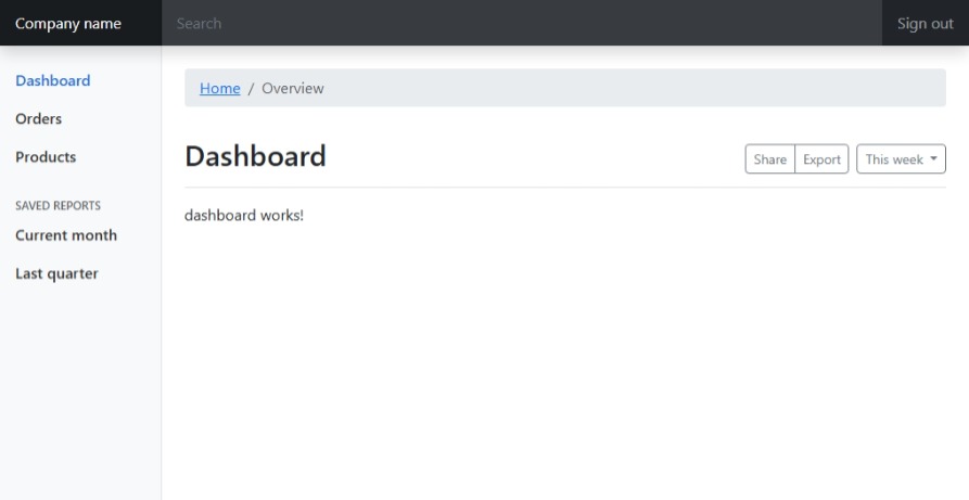
Bootstrap 5 dashboard layout
The layout will contain the following sections:
- A navigation bar with Company name, navigation toggle for small screens, search input field and “Sign out” button
- A sidebar with navigation items
- The main content area with a section to show the breadcrumbs, title, toolbar, and for the current page
Basic Boostrap 5 HTML skeleton:
<html lang="en">
<head>
  <meta charset="UTF-8">
  <meta name="viewport" content="width=device-width, initial-scale=1.0">
  <title>Bootstrap 5 Dashboard Layout</title>
  <style>
      <!-- layout specific CSS here -->
  </style>
</head>
<body>
<header class="navbar navbar-dark sticky-top bg-dark flex-md-nowrap p-0 shadow">
    <a class="navbar-brand col-md-3 col-lg-2 me-0 px-3" href="#">Company name</a>
    <button class="navbar-toggler position-absolute d-md-none collapsed" type="button" data-bs-toggle="collapse"
            data-bs-target="#sidebarMenu" aria-controls="sidebarMenu" aria-expanded="false"
            aria-label="Toggle navigation">
        <span class="navbar-toggler-icon"></span>
    </button>
    <input class="form-control form-control-dark w-100" type="text" placeholder="Search" aria-label="Search">
    <div class="navbar-nav">
        <div class="nav-item text-nowrap">
            <a class="nav-link px-3" href="#">Sign out</a>
        </div>
    </div>
</header>

<div class="container-fluid">
    <div class="row">
        <nav id="sidebarMenu" class="col-md-3 col-lg-2 d-md-block bg-light sidebar collapse">
            <div class="position-sticky pt-3">
                <ul class="nav flex-column">
                    <li class="nav-item">
                        <a class="nav-link active" aria-current="page" href="#">
                            <span data-feather="home"></span>
                            Dashboard
                        </a>
                    </li>
                    <li class="nav-item">
                        <a class="nav-link" href="#">
                            <span data-feather="file"></span>
                            Orders
                        </a>
                    </li>
                    <li class="nav-item">
                        <a class="nav-link" href="#">
                            <span data-feather="shopping-cart"></span>
                            Products
                        </a>
                    </li>
                </ul>

                <h6 class="sidebar-heading d-flex justify-content-between align-items-center px-3 mt-4 mb-1 text-muted">
                    <span>Saved reports</span>
                    <a class="link-secondary" href="#" aria-label="Add a new report">
                        <span data-feather="plus-circle"></span>
                    </a>
                </h6>
                <ul class="nav flex-column mb-2">
                    <li class="nav-item">
                        <a class="nav-link" href="#">
                            <span data-feather="file-text"></span>
                            Current month
                        </a>
                    </li>
                    <li class="nav-item">
                        <a class="nav-link" href="#">
                            <span data-feather="file-text"></span>
                            Last quarter
                        </a>
                    </li>
                </ul>
            </div>
        </nav>

        <main class="col-md-9 ms-sm-auto col-lg-10 px-md-4">
            <nav aria-label="breadcrumb" class="pt-3">
                <ol class="breadcrumb">
                    <li class="breadcrumb-item"><a href="#">Home</a></li>
                    <li class="breadcrumb-item active" aria-current="page">Overview</li>
                </ol>
            </nav>

            <div
                    class="d-flex justify-content-between flex-wrap flex-md-nowrap align-items-center pt-3 pb-2 mb-3 border-bottom">
                <h1 class="h2">Dashboard</h1>
                <div class="btn-toolbar mb-2 mb-md-0">
                    <div class="btn-group me-2">
                        <button type="button" class="btn btn-sm btn-outline-secondary">Share</button>
                        <button type="button" class="btn btn-sm btn-outline-secondary">Export</button>
                    </div>
                    <button type="button" class="btn btn-sm btn-outline-secondary dropdown-toggle">
                        <span data-feather="calendar"></span>
                        This week
                    </button>
                </div>
            </div>

            <router-outlet></router-outlet>
        </main>
    </div>
</div>

</body>
Create and integrate basic LayoutComponent
The basic layout HTML is implemented in a LayoutComponent that will be used as a wrapper for all other components.
The LayoutComponent will contain the navbar, sidebar, footer, and a router outlet for dynamic content loading of the child components.
Create the wrapper component LayoutComponent (generated selector will be ‘app-layout’) holding layout structure:
$ ng generate component Layout
CREATE src/app/layout/layout.component.html (22 bytes)
CREATE src/app/layout/layout.component.spec.ts (615 bytes)
CREATE src/app/layout/layout.component.ts (226 bytes)
CREATE src/app/layout/layout.component.scss (0 bytes)
Add <router-outlet></router-outlet> (for child components output) to layout.component.html:
<p>layout works!</p>
<router-outlet></router-outlet>
Add default route to app.routes.ts:
import {Routes} from '@angular/router';
import {LayoutComponent} from './layout/layout.component';

export const routes: Routes = [
  {path: '', component: LayoutComponent},
];
Now the LayoutComponent holds the layout structure and router outlet for child components.
The application init sequence on route call to ‘’ will be as follows:
- index.html
<app-root></app-root>→ app.component.html<router-outlet></router-outlet>→ layout.component.html<router-outlet></router-outlet>→ child component of LayoutComponent
When we start the application with ng serve we just will see “layout works!” on a blank unstructured page, which means the setup is working.
Add layout HTML and CSS to LayoutComponent
Now let’s add the layout HTML to layout.component.html:
<header class="navbar navbar-dark sticky-top bg-dark flex-md-nowrap p-0 shadow">
    <a class="navbar-brand col-md-3 col-lg-2 me-0 px-3" href="#">Company name</a>
    <button class="navbar-toggler position-absolute d-md-none collapsed" type="button" data-bs-toggle="collapse"
            data-bs-target="#sidebarMenu" aria-controls="sidebarMenu" aria-expanded="false"
            aria-label="Toggle navigation">
        <span class="navbar-toggler-icon"></span>
    </button>
    <input class="form-control form-control-dark w-100" type="text" placeholder="Search" aria-label="Search">
    <div class="navbar-nav">
        <div class="nav-item text-nowrap">
            <a class="nav-link px-3" href="#">Sign out</a>
        </div>
    </div>
</header>

<div class="container-fluid">
    <div class="row">
        <nav id="sidebarMenu" class="col-md-3 col-lg-2 d-md-block bg-light sidebar collapse">
            <div class="position-sticky pt-3">
                <ul class="nav flex-column">
                    <li class="nav-item">
                        <a class="nav-link active" aria-current="page" href="#">
                            <span data-feather="home"></span>
                            Dashboard
                        </a>
                    </li>
                    <li class="nav-item">
                        <a class="nav-link" href="#">
                            <span data-feather="file"></span>
                            Orders
                        </a>
                    </li>
                    <li class="nav-item">
                        <a class="nav-link" href="#">
                            <span data-feather="shopping-cart"></span>
                            Products
                        </a>
                    </li>
                </ul>

                <h6 class="sidebar-heading d-flex justify-content-between align-items-center px-3 mt-4 mb-1 text-muted">
                    <span>Saved reports</span>
                    <a class="link-secondary" href="#" aria-label="Add a new report">
                        <span data-feather="plus-circle"></span>
                    </a>
                </h6>
                <ul class="nav flex-column mb-2">
                    <li class="nav-item">
                        <a class="nav-link" href="#">
                            <span data-feather="file-text"></span>
                            Current month
                        </a>
                    </li>
                    <li class="nav-item">
                        <a class="nav-link" href="#">
                            <span data-feather="file-text"></span>
                            Last quarter
                        </a>
                    </li>
                </ul>
            </div>
        </nav>

        <main class="col-md-9 ms-sm-auto col-lg-10 px-md-4">
            <nav aria-label="breadcrumb" class="pt-4">
                <ol class="breadcrumb">
                    <li class="breadcrumb-item"><a href="#">Home</a></li>
                    <li class="breadcrumb-item active" aria-current="page">Overview</li>
                </ol>
            </nav>

            <div
                    class="d-flex justify-content-between flex-wrap flex-md-nowrap align-items-center pt-3 pb-2 mb-3 border-bottom">
                <h1 class="h2">Dashboard</h1>
                <div class="btn-toolbar mb-2 mb-md-0">
                    <div class="btn-group me-2">
                        <button type="button" class="btn btn-sm btn-outline-secondary">Share</button>
                        <button type="button" class="btn btn-sm btn-outline-secondary">Export</button>
                    </div>
                    <button type="button" class="btn btn-sm btn-outline-secondary dropdown-toggle">
                        <span data-feather="calendar"></span>
                        This week
                    </button>
                </div>
            </div>

            <router-outlet></router-outlet>
        </main>
    </div>
</div>
Add the layout specific CSS to layout.component.scss:
body {
  font-size: .875rem;
}

.feather {
  width: 16px;
  height: 16px;
  vertical-align: text-bottom;
}

.breadcrumb {
  display: flex;
  flex-wrap: wrap;
  padding: .5rem 1rem;
  margin-bottom: 1rem;
  list-style: none;
  background-color: #e9ecef;
  border-radius: .25rem;
}

/*
 * Sidebar
 */

.sidebar {
  position: fixed;
  top: 0;
  /* rtl:raw:
  right: 0;
  */
  bottom: 0;
  /* rtl:remove */
  left: 0;
  z-index: 100; /* Behind the navbar */
  padding: 48px 0 0; /* Height of navbar */
  box-shadow: inset -1px 0 0 rgba(0, 0, 0, .1);
}

@media (max-width: 767.98px) {
  .sidebar {
    top: 5rem;
  }
}

.sidebar-sticky {
  position: relative;
  top: 0;
  height: calc(100vh - 48px);
  padding-top: .5rem;
  overflow-x: hidden;
  overflow-y: auto; /* Scrollable contents if viewport is shorter than content. */
}

.sidebar .nav-link {
  font-weight: 500;
  color: #333;
}

.sidebar .nav-link .feather {
  margin-right: 4px;
  color: #727272;
}

.sidebar .nav-link.active {
  color: #2470dc;
}

.sidebar .nav-link:hover .feather,
.sidebar .nav-link.active .feather {
  color: inherit;
}

.sidebar-heading {
  font-size: .75rem;
  text-transform: uppercase;
}

/*
 * Navbar
 */

.navbar-brand {
  padding-top: .75rem;
  padding-bottom: .75rem;
  font-size: 1rem;
  background-color: rgba(0, 0, 0, .25);
  box-shadow: inset -1px 0 0 rgba(0, 0, 0, .25);
}

.navbar .navbar-toggler {
  top: .25rem;
  right: 1rem;
}

.navbar .form-control {
  padding: .75rem 1rem;
  border-width: 0;
  border-radius: 0;
}

.form-control-dark {
  color: #fff;
  background-color: rgba(255, 255, 255, .1);
  border-color: rgba(255, 255, 255, .1);
}

.form-control-dark:focus {
  color: #000;
  border-color: transparent;
  background-color: rgba(255, 255, 255, 1.0);
  box-shadow: 0 0 0 3px rgba(255, 255, 255, .25);
}

.form-control-dark::placeholder {
  color: #6c757d;
  opacity: 1;
}
Create feature component / page
As first feature component we will create a DashboardComponent that will be displayed in the main content area of the layout.
$ ng generate component features/Dashboard
CREATE src/app/features/dashboard/dashboard.component.html (25 bytes)
CREATE src/app/features/dashboard/dashboard.component.spec.ts (636 bytes)
CREATE src/app/features/dashboard/dashboard.component.ts (238 bytes)
CREATE src/app/features/dashboard/dashboard.component.scss (0 bytes)
Add feature components as child routes
Add all feature pages as child routes under LayoutComponent:
const routes: Routes = [
  {
    path: '',
    component: LayoutComponent,
    children: [
      {
        path: 'dashboard',
        component: DashboardComponent
      }
    ]
  }
];
Requesting http://localhost:4200/dashboard will now display the DashboardComponent in the main content area of the layout:
Dynamic Breadcrumb navigation
To implement a dynamic breadcrumb navigation we will use the ActivatedRoute service to get the current route and display it in the breadcrumb area.
$ ng generate component shared/breadcrumb-navigation
CREATE src/app/shared/breadcrumb-navigation/breadcrumb-navigation.component.html (37 bytes)
CREATE src/app/shared/breadcrumb-navigation/breadcrumb-navigation.component.spec.ts (714 bytes)
CREATE src/app/shared/breadcrumb-navigation/breadcrumb-navigation.component.ts (285 bytes)
CREATE src/app/shared/breadcrumb-navigation/breadcrumb-navigation.component.scss (0 bytes)
Add the breadcrumb navigation to layout.component.html:
<main class="col-md-9 ms-sm-auto col-lg-10 px-md-4">
  <app-breadcrumb-navigation></app-breadcrumb-navigation>
  <!--
  <nav aria-label="breadcrumb" class="pt-4">
    <ol class="breadcrumb">
      <li class="breadcrumb-item"><a href="#">Home</a></li>
      <li class="breadcrumb-item active" aria-current="page">Overview</li>
    </ol>
  </nav>
  -->
Add breadcrumb label to app.routes.ts
Add a data.breadcrumb.label property to the routes in app.routes.ts:
export const routes: Routes = [
  {
    path: '',
    component: LayoutComponent,
    title: 'Book2Ebook Studio',
    data: {
      breadcrumb: {
        label: 'Home'
      }
    },
    children: [
      {
        path: 'dashboard',
        component: DashboardComponent,
        title: 'Dashboard',
        data: {
          breadcrumb: {
            label: 'Dashboard'
          }
        }
      }
    ]
  },
];
Add breadcrumb navigation logic
Add the breadcrumb navigation logic to breadcrumb-navigation.component.ts:
import {Component} from '@angular/core';
import {ActivatedRoute, NavigationEnd, Router, RouterLink} from '@angular/router';

export interface Breadcrumb {
  label: string;
  link: string;
}

@Component({
  selector: 'app-breadcrumb-navigation',
  imports: [
    RouterLink
  ],
  templateUrl: './breadcrumb-navigation.component.html',
  styleUrl: './breadcrumb-navigation.component.scss'
})
export class BreadcrumbNavigationComponent {
  breadcrumbs: Breadcrumb[] = [];

  constructor(private router: Router, private activatedRoute: ActivatedRoute) {
    this.router.events.subscribe((ev) => {
      if (ev instanceof NavigationEnd) {
        this.breadcrumbs = [];
        this.buildBreadcrumb(this.activatedRoute);
      }
    });
  }

  buildBreadcrumb(currentAR: ActivatedRoute): void {
    // Für jede Route, die einen definierten breadcrumb hat ...
    if (currentAR.snapshot.data['breadcrumb']) {
      // ... nehme, falls vorhanden, vom letzten Breadcrumb den bisherigen Path
      const lastBCLink =
        this.breadcrumbs.length !== 0
          ? this.breadcrumbs[this.breadcrumbs.length - 1].link
          : '';

      // ... füge den aktuellen hinzu ...
      let currentBCLink = '';
      if (currentAR?.routeConfig?.path?.startsWith(':')) {
        // ... entweder, bei dynamischen Routen, dank dem Resolver
        currentBCLink = currentAR.snapshot.data['breadcrumb'].link;
      } else {
        // ... oder, bei statischen Routen, aus der RouteConfig
        currentBCLink = currentAR?.routeConfig?.path || '';
      }

      // ... füge den aktuellen Breadcrumb ins Breadcrumbs-Array hinzu
      this.breadcrumbs.push({
        label: currentAR.snapshot.data['breadcrumb'].label,
        link: lastBCLink + '/' + currentBCLink,
      } as Breadcrumb);
    }

    // ... und wiederhole das ganze rekursiv für alle folgenden RouteChildren
    if (currentAR.firstChild !== null) {
      this.buildBreadcrumb(currentAR.firstChild);
    }
  }
}
Add breadcrumb navigation HTML
Add the breadcrumb navigation HTML to breadcrumb-navigation.component.html:
<nav aria-label="breadcrumb" class="pt-4">
  <ol class="breadcrumb">
    @for (bc of breadcrumbs; track bc.link) {
      @if (!$last) {
        <li class="breadcrumb-item">
          <a [routerLink]="bc.link"></a>
        </li>
      } @else {
        <li class="breadcrumb-item active" aria-current="page"></li>
      }
    }
  </ol>
</nav>
Add breadcrumb navigation CSS
Add the breadcrumb navigation CSS to breadcrumb-navigation.component.scss:
.breadcrumb {
  display: flex;
  flex-wrap: wrap;
  padding: .5rem 1rem;
  margin-bottom: 1rem;
  list-style: none;
  background-color: #e9ecef;
  border-radius: .25rem;
}
(and remove it from layout.component.scss)
Sidebar navigation items
Until now, we have a static design dummy of the sidebar in layout.component.html.
Let’s create a SidebarComponent that will hold the sidebar navigation items and will be used in the LayoutComponent.
$ ng generate component layout/sidebar
CREATE src/app/layout/sidebar/sidebar.component.html (23 bytes)
CREATE src/app/layout/sidebar/sidebar.component.spec.ts (622 bytes)
CREATE src/app/layout/sidebar/sidebar.component.ts (230 bytes)
CREATE src/app/layout/sidebar/sidebar.component.scss (0 bytes)
We replace the current sidebar HTML with a hierarchical structure of the sidebar navigation items (see examples here).
Add the sidebar HTML to sidebar.component.html:
<ul class="list-unstyled ps-0">
  <li class="mb-1">
    <a href="#" class="ms-3 link-body-emphasis text-decoration-none rounded" [routerLink]="['/dashboard']">Dashboard</a>
  </li>

  <li class="mb-1">
    <button class="btn btn-toggle d-inline-flex align-items-center rounded border-0 collapsed" data-bs-toggle="collapse" data-bs-target="#home-collapse" aria-expanded="false">
      Home
    </button>
    <div class="collapse" id="home-collapse" style="">
      <ul class="btn-toggle-nav list-unstyled fw-normal pb-1 small">
        <li><a href="#" class="link-body-emphasis d-inline-flex text-decoration-none rounded">Overview</a></li>
        <li><a href="#" class="link-body-emphasis d-inline-flex text-decoration-none rounded">Updates</a></li>
        <li><a href="#" class="link-body-emphasis d-inline-flex text-decoration-none rounded">Reports</a></li>
      </ul>
    </div>
  </li>
  <li class="mb-1">
    <button class="btn btn-toggle d-inline-flex align-items-center rounded border-0 collapsed" data-bs-toggle="collapse" data-bs-target="#dashboard-collapse" aria-expanded="false">
      Reports
    </button>
    <div class="collapse" id="dashboard-collapse">
      <ul class="btn-toggle-nav list-unstyled fw-normal pb-1 small">
        <li><a href="#" class="link-body-emphasis d-inline-flex text-decoration-none rounded">Overview</a></li>
        <li><a href="#" class="link-body-emphasis d-inline-flex text-decoration-none rounded">Weekly</a></li>
        <li><a href="#" class="link-body-emphasis d-inline-flex text-decoration-none rounded">Monthly</a></li>
        <li><a href="#" class="link-body-emphasis d-inline-flex text-decoration-none rounded">Annually</a></li>
      </ul>
    </div>
  </li>
  <li class="mb-1">
    <button class="btn btn-toggle d-inline-flex align-items-center rounded border-0 collapsed" data-bs-toggle="collapse" data-bs-target="#orders-collapse" aria-expanded="false">
      Orders
    </button>
    <div class="collapse" id="orders-collapse">
      <ul class="btn-toggle-nav list-unstyled fw-normal pb-1 small">
        <li><a href="#" class="link-body-emphasis d-inline-flex text-decoration-none rounded">New</a></li>
        <li><a href="#" class="link-body-emphasis d-inline-flex text-decoration-none rounded">Processed</a></li>
        <li><a href="#" class="link-body-emphasis d-inline-flex text-decoration-none rounded">Shipped</a></li>
        <li><a href="#" class="link-body-emphasis d-inline-flex text-decoration-none rounded">Returned</a></li>
      </ul>
    </div>
  </li>
  <li class="border-top my-3"></li>
  <li class="mb-1">
    <button class="btn btn-toggle d-inline-flex align-items-center rounded border-0 collapsed" data-bs-toggle="collapse" data-bs-target="#account-collapse" aria-expanded="false">
      Account
    </button>
    <div class="collapse" id="account-collapse" style="">
      <ul class="btn-toggle-nav list-unstyled fw-normal pb-1 small">
        <li><a href="#" class="link-body-emphasis d-inline-flex text-decoration-none rounded">New...</a></li>
        <li><a href="#" class="link-body-emphasis d-inline-flex text-decoration-none rounded">Profile</a></li>
        <li><a href="#" class="link-body-emphasis d-inline-flex text-decoration-none rounded">Settings</a></li>
        <li><a href="#" class="link-body-emphasis d-inline-flex text-decoration-none rounded">Sign out</a></li>
      </ul>
    </div>
  </li>
</ul>
and the sidebar CSS to sidebar.component.scss:
.btn-toggle {
  padding: .25rem .5rem;
  font-weight: 600;
  color: var(--bs-emphasis-color);
  background-color: transparent;
}

.btn-toggle::before {
  width: 1.25em;
  line-height: 0;
  content: url("data:image/svg+xml;utf-8,<svg xmlns='http://www.w3.org/2000/svg' width='16' height='16' viewBox='0 0 16 16'><path fill='none' stroke='rgba(0,0,0,.5)' stroke-linecap='round' stroke-linejoin='round' stroke-width='2' d='M5 14l6-6-6-6'/></svg>");
  transition: transform .35s ease;
  transform-origin: .5em 50%;
}

.btn-toggle:hover, .btn-toggle:focus {
  color: rgba(var(--bs-emphasis-color-rgb), .85);
  /*background-color: var(--bs-tertiary-bg);*/
  background-color: white;
}

[data-bs-theme="dark"] .btn-toggle::before {
  content: url("data:image/svg+xml;utf-8,<svg xmlns='http://www.w3.org/2000/svg' width='16' height='16' viewBox='0 0 16 16'><path fill='none' stroke='rgba(255,255,255,.5)' stroke-linecap='round' stroke-linejoin='round' stroke-width='2' d='M5 14l6-6-6-6'/></svg>");
}

.btn-toggle[aria-expanded="true"] {
  color: rgba(var(--bs-emphasis-color-rgb), .85);
}
.btn-toggle[aria-expanded="true"]::before {
  transform: rotate(90deg);
}

.btn-toggle-nav a {
  padding: .1875rem .5rem;
  margin-top: .125rem;
  margin-left: 1.25rem;
}
.btn-toggle-nav a:hover,
.btn-toggle-nav a:focus {
  background-color: var(--bs-tertiary-bg);
}
and replace the sidebar HTML from layout.component.html (we let the wrapping nav and div in place, because moving them to sidebar caused display issues):
<div class="container-fluid">
  <div class="row">
    <nav id="sidebarMenu" class="col-md-3 col-lg-2 d-md-block bg-light sidebar collapse">
      <div class="position-sticky pt-3">
        <app-sidebar></app-sidebar>
      </div>
    </nav>

    <main class="col-md-9 ms-sm-auto col-lg-10 px-md-4">
      <app-breadcrumb-navigation></app-breadcrumb-navigation>
Final result
Finally, we get a dashboard layout with a sticky top navigation bar and a sticky sidebar navigation that is responsive to different screen sizes.
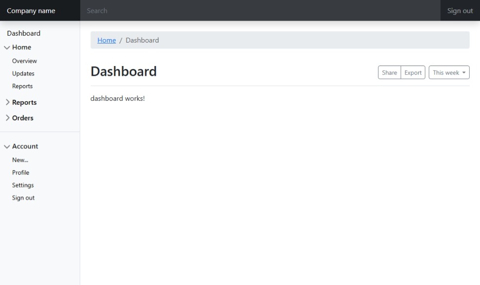
Some things are left to do:
- use Bootstrap icons
- move navbar to an own layout component
- change page title accordingly to activated route
- highlight active sidebar item
For now enjoy the result!